The Importance of Fonts in Web Design
The Importance of Fonts in Web Design: How Typography Shapes User Experience
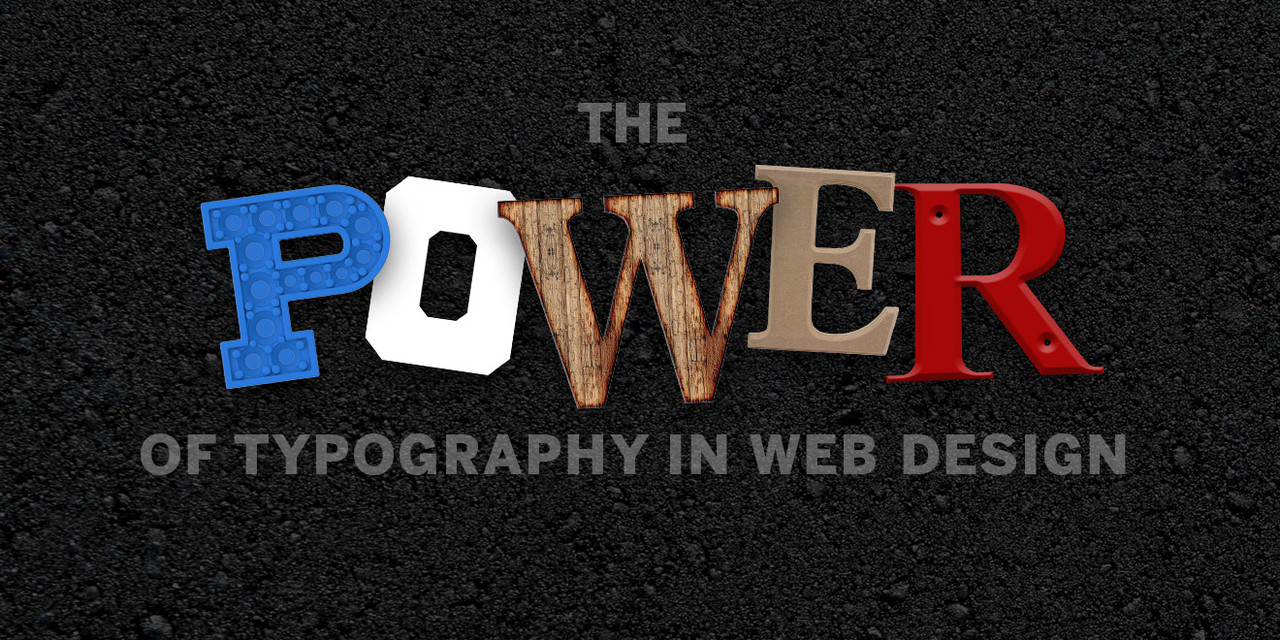
When it comes to web design, many people focus on layout, colors, and images—but typography is just as crucial. Fonts play a vital role in readability, branding, and overall user experience. Choosing the right typefaces can make the difference between a professional, engaging website and one that feels outdated or difficult to read.
In this blog post, we’ll explore why fonts matter in web design, how they influence user perception, and best practices for selecting and implementing typography effectively.
1. Why Fonts Matter in Web Design
A. Readability and Legibility
The primary purpose of text on a website is to communicate information. If users struggle to read your content, they’ll leave. Fonts impact readability in several ways:
- Font size – Too small, and users strain their eyes; too large, and the text feels overwhelming.
- Line spacing (leading) – Proper spacing between lines improves readability.
- Letter spacing (kerning) – Adjusting space between letters ensures clarity.
- Contrast – Text should stand out against the background (e.g., dark text on a light background).
B. Brand Identity and Personality
Fonts convey emotions and brand personality:
- Serif fonts (e.g., Times New Roman, Georgia) – Traditional, professional, authoritative.
- Sans-serif fonts (e.g., Arial, Helvetica) – Modern, clean, approachable.
- Script fonts (e.g., Brush Script, Pacifico) – Elegant, creative, personal.
- Display fonts (e.g., Impact, Bebas Neue) – Bold, attention-grabbing.
For example, a law firm might use a serif font to appear trustworthy, while a tech startup might opt for a sleek sans-serif to convey innovation.
C. User Experience (UX) and Engagement
Good typography enhances UX by:
- Guiding users – Headings, subheadings, and body text create hierarchy.
- Improving scannability – Users skim content; clear typography helps them find information quickly.
- Reducing bounce rates – If text is easy to read, visitors stay longer.
2. How Fonts Influence Perception
A. Trust and Credibility
A poorly chosen font can make a site look untrustworthy. Studies show that users judge a website’s credibility within seconds—typography plays a key role in that first impression.
B. Emotional Impact
Different fonts evoke different feelings:
- Bold, heavy fonts – Strength, confidence.
- Light, thin fonts – Elegance, sophistication.
- Rounded, friendly fonts – Approachability, warmth.
C. Accessibility Considerations
Web fonts must be accessible to all users, including those with visual impairments. Best practices include:
- Using web-safe fonts (e.g., Google Fonts, system fonts).
- Ensuring sufficient contrast (WCAG guidelines recommend at least 4.5:1 for normal text).
- Avoiding overly decorative fonts for body text.
3. Best Practices for Choosing Web Fonts
A. Limit the Number of Fonts
Too many fonts create visual clutter. Stick to:
- 1-2 typefaces (e.g., one for headings, one for body).
- 2-3 font weights (e.g., regular, bold, italic).
B. Prioritize Readability
- Body text: Use simple, legible fonts (e.g., Open Sans, Roboto).
- Headings: Can be more stylized but still clear.
C. Use Web-Friendly Fonts
- Google Fonts (free, widely supported).
- Adobe Fonts (premium, high-quality options).
- System fonts (Arial, Helvetica, Georgia) for faster loading.
D. Optimize Loading Speed
Custom fonts can slow down a website. To improve performance:
- Use font-display: swap (to prevent invisible text while loading).
- Subset fonts (load only necessary characters).
- Preload critical fonts.
E. Test Across Devices
Fonts render differently on various screens. Always test on:
- Desktop
- Mobile
- Tablet
4. Common Typography Mistakes to Avoid
A. Using Too Many Fonts
Mixing multiple typefaces without a clear hierarchy confuses users.
B. Poor Contrast
Light gray text on a white background is hard to read.
C. Ignoring Mobile Readability
Small font sizes that work on desktop may be unreadable on mobile.
D. Overusing Decorative Fonts
Fancy fonts are great for logos or headings but terrible for long paragraphs.
E. Not Considering Line Length
Ideal line length is 50-75 characters—too long or too short strains readability.
5. Tools for Choosing and Testing Fonts
- Google Fonts (free library of web fonts).
- Font Pair (helps find complementary fonts).
- TypeScale (generates harmonious font scales).
- WhatFont (browser extension to identify fonts on any site).
- WebAIM Contrast Checker (ensures text meets accessibility standards).
6. Typography is a Powerful Design Tool
Fonts are more than just letters on a screen—they shape how users perceive your brand, navigate your site, and engage with your content. By choosing the right fonts, optimizing for readability, and following best practices, you can create a website that is both visually appealing and highly functional.
Key Takeaways:
- Readability is king – Prioritize legibility in body text.
- Fonts convey brand personality – Choose typefaces that align with your identity.
- Less is more – Stick to 1-2 fonts for consistency.
- Test across devices – Ensure fonts look good on all screens.
- Optimize for speed – Don’t let custom fonts slow down your site.
By paying attention to typography, you enhance user experience, strengthen branding, and make your website more effective. So next time you design a site, remember: great fonts make a great first impression!